![[Text] Text 패러미터 정리](https://img1.daumcdn.net/thumb/R750x0/?scode=mtistory2&fname=https%3A%2F%2Fblog.kakaocdn.net%2Fdn%2FbqVceg%2FbtslMo05WF0%2FjdZE3i3meWQDlQ6amkaFK0%2Fimg.png)

컴포즈 프로젝트를 생성하면 가장 먼저 만나는 컴포저블인 Text입니다. 기존 안드로이드의 TextView는 수많은 위젯의 부모였지만 컴포즈에선 그냥 단일 함수입니다.
전체 코드
@Composable
fun Text(
    text: String,
    modifier: Modifier = Modifier,
    color: Color = Color.Unspecified,
    fontSize: TextUnit = TextUnit.Unspecified,
    fontStyle: FontStyle? = null,
    fontWeight: FontWeight? = null,
    fontFamily: FontFamily? = null,
    letterSpacing: TextUnit = TextUnit.Unspecified,
    textDecoration: TextDecoration? = null,
    textAlign: TextAlign? = null,
    lineHeight: TextUnit = TextUnit.Unspecified,
    overflow: TextOverflow = TextOverflow.Clip,
    softWrap: Boolean = true,
    maxLines: Int = Int.MAX_VALUE,
    onTextLayout: (TextLayoutResult) -> Unit = {},
    style: TextStyle = LocalTextStyle.current
) {

    val textColor = color.takeOrElse {
        style.color.takeOrElse {
            LocalContentColor.current
        }
    }
    // NOTE(text-perf-review): It might be worthwhile writing a bespoke merge implementation that
    // will avoid reallocating if all of the options here are the defaults
    val mergedStyle = style.merge(
        TextStyle(
            color = textColor,
            fontSize = fontSize,
            fontWeight = fontWeight,
            textAlign = textAlign,
            lineHeight = lineHeight,
            fontFamily = fontFamily,
            textDecoration = textDecoration,
            fontStyle = fontStyle,
            letterSpacing = letterSpacing
        )
    )
    BasicText(
        text,
        modifier,
        mergedStyle,
        onTextLayout,
        overflow,
        softWrap,
        maxLines,
    )
}
패러미터가 엄청나게 많지만 하나하나 알아봅시다.
text (문구)
가장 기본이 되는 패러미터이자, 필수적으로 들어가야 하는 패러미터입니다.
@Composable
fun Greeting(name: String, modifier: Modifier = Modifier) {
    Column() {
        Text(
            text = "Hello $name!",
            modifier = modifier
        )
    }
}
원하는 문구를 넘겨주면 렌더링 시 그 문구를 출력합니다.
modifier (수정자)
compose의 수정자입니다. 수정자에 관해선 뒤에서 자세히 다룰 예정이므로 간단히 설명하자면, UI를 꾸미거나 행동을 추가하기 위한 요소들의 모임입니다. 모든 컴포저블 함수는 수정자를 패러미터로 가집니다.
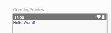
color (색상)
텍스트의 색상을 지정할 수 있습니다.
Text(
text = "Hello $name!",
modifier = modifier,
color = Color.Red
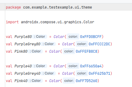
)색깔은 compose에서 기본적으로 제공해 주는 Color 오브젝트를 써도 되지만 ui/theme/Color.kt에 직접 선언해서 사용해도 됩니다.
Text(
    text = "Hello $name!",
    modifier = modifier,
    color = Purple40
)
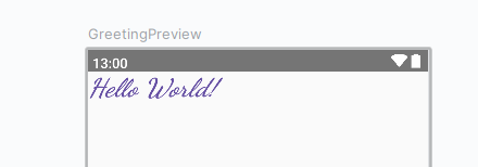
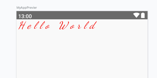
fontSize, fontStyle, fontFamily (크기, 스타일, 글자체)
폰트 크기, 스타일, 글자체를 설정할 수 있습니다.
Text(
    text = "Hello $name!",
    modifier = modifier,
    color = Purple40,
    fontSize = 30.sp,
    fontWeight = FontWeight.Bold,
    fontStyle = FontStyle.Italic,
    fontFamily = FontFamily.Cursive
)- 글자 크기는 30sp
- 글자 굵기는 Bold체
- 글자 스타일은 이탤리체(대각선으로 꺾인 거)
- 글자체는 휘어진 글자체
로 했습니다.
FontStyle
기존 안드로이드에서 sp로 설정하는 것과 동일합니다. 다만 컴포즈에선 TextUnit 타입으로 줘야 하는데 Int타입 뒤에. sp를 붙이는 것으로 캐스팅할 수 있습니다. dp로 폰트 크기를 고정하는 방법은 따로 정리할 생각입니다.
FontWeight
Companion object에 기본적으로 제공하는 굵기들이 있습니다. 자주 사용하는 Bold 체부터, 원하는 굵기에 맞춰 사용하면 됩니다.
@Immutable
class FontWeight(val weight: Int) : Comparable<FontWeight> {
    companion object {
        /** [Thin] */
        @Stable
        val W100 = FontWeight(100)
        /** [ExtraLight] */
        @Stable
        val W200 = FontWeight(200)
        /** [Light] */
        @Stable
        val W300 = FontWeight(300)
        /** [Normal] / regular / plain */
        @Stable
        val W400 = FontWeight(400)
        /** [Medium] */
        @Stable
        val W500 = FontWeight(500)
        /** [SemiBold] */
        @Stable
        val W600 = FontWeight(600)
        /** [Bold] */
        @Stable
        val W700 = FontWeight(700)
        /** [ExtraBold] */
        @Stable
        val W800 = FontWeight(800)
        /** [Black] */
        @Stable
        val W900 = FontWeight(900)

        /** Alias for [W100] */
        @Stable
        val Thin = W100
        /** Alias for [W200] */
        @Stable
        val ExtraLight = W200
        /** Alias for [W300] */
        @Stable
        val Light = W300
        /** The default font weight - alias for [W400] */
        @Stable
        val Normal = W400
        /** Alias for [W500] */
        @Stable
        val Medium = W500
        /** Alias for [W600] */
        @Stable
        val SemiBold = W600
        /**
         * A commonly used font weight that is heavier than normal - alias for [W700]
         */
        @Stable
        val Bold = W700
        /** Alias for [W800] */
        @Stable
        val ExtraBold = W800
        /** Alias for [W900] */
        @Stable
        val Black = W900

        /** A list of all the font weights. */
        internal val values: List<FontWeight> = listOf(
            W100,
            W200,
            W300,
            W400,
            W500,
            W600,
            W700,
            W800,
            W900
        )
    }
    ...
}
FontStyle
일반, 이태리체 2개가 있습니다. 만약 다른 글꼴을 원한다면 추가할 수 있습니다.
@kotlin.jvm.JvmInline
value class FontStyle(val value: Int) {

    override fun toString(): String {
        return when (this) {
            Normal -> "Normal"
            Italic -> "Italic"
            else -> "Invalid"
        }
    }

    companion object {
        /** Use the upright glyphs */
        val Normal = FontStyle(0)

        /** Use glyphs designed for slanting */
        val Italic = FontStyle(1)

        /** Returns a list of possible values of [FontStyle]. */
        fun values(): List<FontStyle> = listOf(Normal, Italic)
    }
}
FontFamily
다양한 글자체가 있고 사용자가 원하는 글자체를 추가할 수도 있습니다.
@Immutable
sealed class FontFamily(canLoadSynchronously: Boolean) {
    companion object {
        /**
         * The platform default font.
         */
        val Default: SystemFontFamily = DefaultFontFamily()

        /**
         * Font family with low contrast and plain stroke endings.
         *
         * @sample androidx.compose.ui.text.samples.FontFamilySansSerifSample
         *
         * See [CSS sans-serif](https://www.w3.org/TR/css-fonts-3/#sans-serif)
         */
        val SansSerif = GenericFontFamily("sans-serif", "FontFamily.SansSerif")

        /**
         * The formal text style for scripts.
         *
         * @sample androidx.compose.ui.text.samples.FontFamilySerifSample
         *
         * See [CSS serif](https://www.w3.org/TR/css-fonts-3/#serif)
         */
        val Serif = GenericFontFamily("serif", "FontFamily.Serif")

        /**
         * Font family where glyphs have the same fixed width.
         *
         * @sample androidx.compose.ui.text.samples.FontFamilyMonospaceSample
         *
         * See [CSS monospace](https://www.w3.org/TR/css-fonts-3/#monospace)
         */
        val Monospace = GenericFontFamily("monospace", "FontFamily.Monospace")

        /**
         * Cursive, hand-written like font family.
         *
         * If the device doesn't support this font family, the system will fallback to the
         * default font.
         *
         * @sample androidx.compose.ui.text.samples.FontFamilyCursiveSample
         *
         * See [CSS cursive](https://www.w3.org/TR/css-fonts-3/#cursive)
         */
        val Cursive = GenericFontFamily("cursive", "FontFamily.Cursive")
    }
}
letterSpacing (자간)
자간 설정입니다. fontSize와 마찬가지로 TextUnit타입이라. sp를 숫자뒤에 붙여주면 됩니다.
Text(
    text = "Hello World",
    modifier = Modifier,
    fontSize = 30.sp,
    fontStyle = FontStyle.Italic,
    fontFamily = FontFamily.Cursive,
    color = Color.Red,
    letterSpacing = 10.sp
)
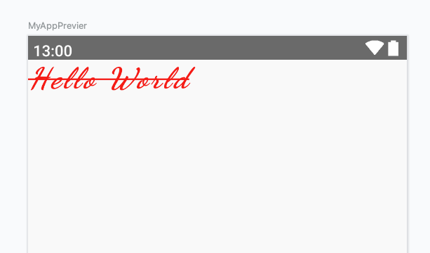
textDecoration (밑줄)
Text의 밑줄 설정입니다. 밑줄과 삭선 2가지를 정할 수 있습니다.
@Immutable
class TextDecoration internal constructor(val mask: Int) {
	companion object {
        @Stable
        val None: TextDecoration = TextDecoration(0x0)

        /**
         * Draws a horizontal line below the text.
         *
         * @sample androidx.compose.ui.text.samples.TextDecorationUnderlineSample
         */
        @Stable
        val Underline: TextDecoration = TextDecoration(0x1)

        /**
         * Draws a horizontal line over the text.
         *
         * @sample androidx.compose.ui.text.samples.TextDecorationLineThroughSample
         */
        @Stable
        val LineThrough: TextDecoration = TextDecoration(0x2)

        /**
         * Creates a decoration that includes all the given decorations.
         *
         * @sample androidx.compose.ui.text.samples.TextDecorationCombinedSample
         *
         * @param decorations The decorations to be added
         */
        fun combine(decorations: List<TextDecoration>): TextDecoration {
            val mask = decorations.fastFold(0) { acc, decoration ->
                acc or decoration.mask
            }
            return TextDecoration(mask)
        }
    }
    ...
}
Text(
text = "Hello World",
modifier = Modifier,
fontSize = 30.sp,
fontStyle = FontStyle.Italic,
fontFamily = FontFamily.Cursive,
color = Color.Red,
letterSpacing = 3.sp,
textDecoration = TextDecoration.LineThrough
)
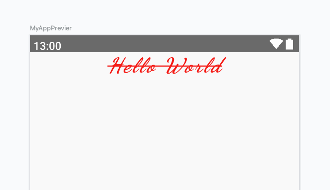
textAlign (정렬)
텍스트 정렬 패러미터입니다. 오른쪽, 가운데, 왼쪽, 양쪽 정렬이 있습니다.
@kotlin.jvm.JvmInline
value class TextAlign internal constructor(internal val value: Int) {

    override fun toString(): String {
        return when (this) {
            Left -> "Left"
            Right -> "Right"
            Center -> "Center"
            Justify -> "Justify"
            Start -> "Start"
            End -> "End"
            else -> "Invalid"
        }
    }
    ...
}
Text(
text = "Hello World",
modifier = Modifier,
fontSize = 30.sp,
fontStyle = FontStyle.Italic,
fontFamily = FontFamily.Cursive,
fontWeight = FontWeight.Bold,
color = Color.Red,
letterSpacing = 3.sp,
textDecoration = TextDecoration.LineThrough,
textAlign = TextAlign.Center
)
lineHeight, maxLine (행간, 최대 줄 개수)
letterSpacing이 자간이었다면 lineHeignt는 줄 간격입니다. maxLine으로 최대 줄 개수를 설정할 수 있습니다.
Text(
text = """
ddd
ddd
ddd
ddd
""".trimIndent(),
modifier = Modifier.fillMaxSize(),
fontSize = 30.sp,
fontStyle = FontStyle.Italic,
fontFamily = FontFamily.Cursive,
fontWeight = FontWeight.Bold,
color = Color.Red,
letterSpacing = 3.sp,
textDecoration = TextDecoration.LineThrough,
textAlign = TextAlign.Center,
lineHeight = 2.sp,
maxLines = 4
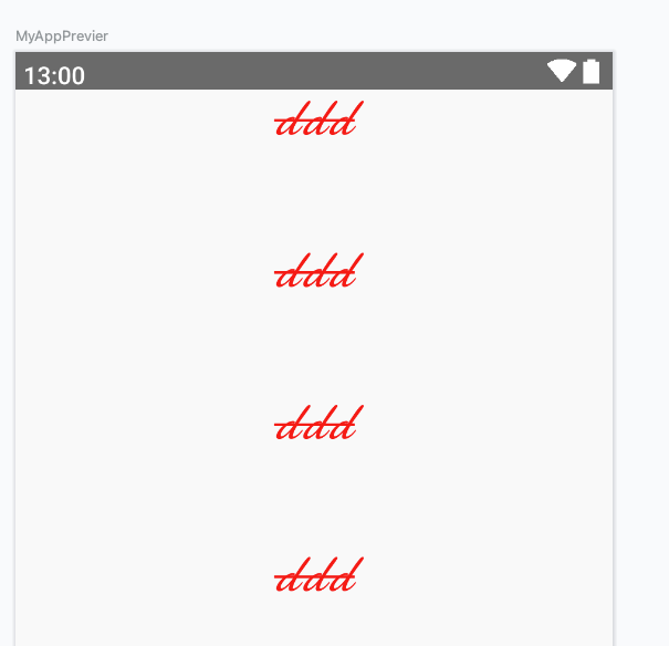
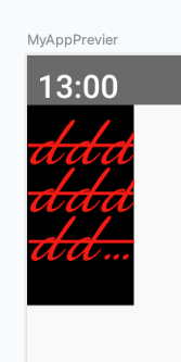
)lineHeight를 2.sp로 설정해 보겠습니다.
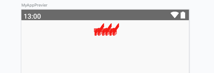
렌더링 된 결과물을 보면 촘촘하게 겹쳐있는 것을 볼 수 있습니다.
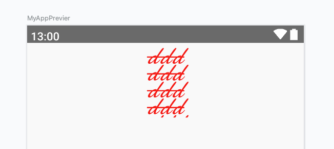
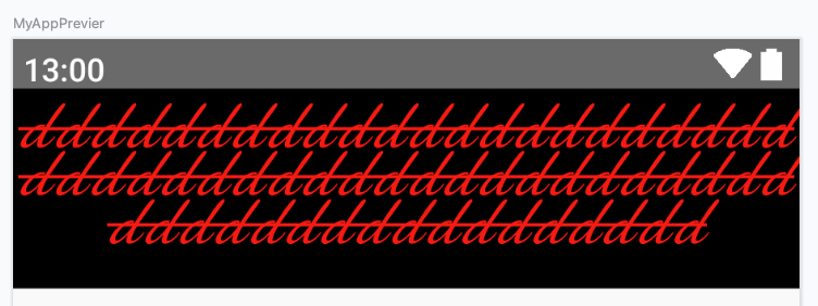
이번엔 반대로 100.sp로 설정했습니다.
아주 넓게 줄 간격이 적용된 것을 볼 수 있습니다.
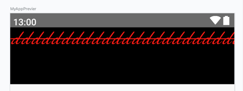
maxLine보다 크게 텍스트 줄 개수를 설정하면 어떻게 되는지 궁금할 수 있습니다.
Text(
    text = """
        ddd
        ddd
        ddd
        ddd
        ddd
        ddd
        ddd
    """.trimIndent(),
    ...
MaxLine을 4개로 설정했기 때문에 줄을 더 작성해도 렌더링 되지 않는 모습을 볼 수 있습니다.
overflow (영역 초과)
텍스트가 지정된 영역을 벗어났을 때 어떻게 처리할 것인지를 정의할 수 있습니다.
@kotlin.jvm.JvmInline
value class TextOverflow internal constructor(internal val value: Int) {

    override fun toString(): String {
        return when (this) {
            Clip -> "Clip"
            Ellipsis -> "Ellipsis"
            Visible -> "Visible"
            else -> "Invalid"
        }
    }
    ...
}
보시는 것과 같이 세 가지 방식으로 설정할 수 있습니다.
우선 텍스트는 상위 레이아웃을 정의해주지 않으면 화면 전체를 상위 레이아웃으로 쓰기 때문에 Column안에 넣어줬습니다.
Column(modifier = Modifier.fillMaxSize()) {
Text(
text = """
ddd
ddd
ddd
ddd
ddd
ddd
ddd
""".trimIndent(),
modifier = Modifier
.height(100.dp)
.background(color = Color.Black),
fontSize = 30.sp,
fontStyle = FontStyle.Italic,
fontFamily = FontFamily.Cursive,
fontWeight = FontWeight.Bold,
color = Color.Red,
letterSpacing = 3.sp,
textDecoration = TextDecoration.LineThrough,
textAlign = TextAlign.Center,
// lineHeight = 30.sp,
// maxLines = 4,
overflow = TextOverflow.Clip
)
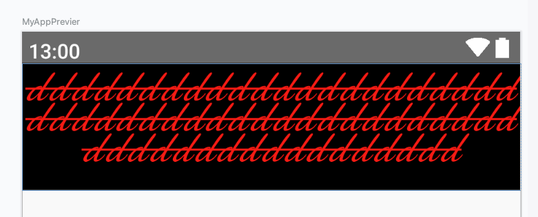
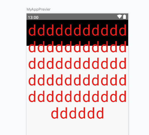
}첫 번째로 Clip입니다.
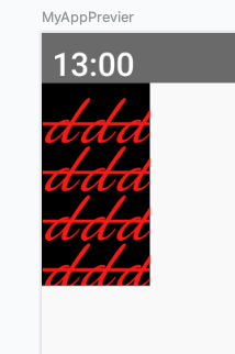
종이를 클립으로 찝은 것처럼 글자가 초과된 만큼 잘린 것을 볼 수 있습니다.
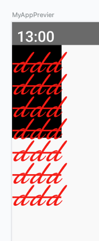
Visible은 영역과 상관없이 다 보이는 것을 알 수 있습니다.
가장 신기한 Ellipsis입니다. 초과된 분량을 줄임표로 나타내고 있습니다.
softWrap (자동 줄 바꿈)
자동 줄 바꿈을 설정하는 패러미터입니다.
true로 설정하면 Text가 정해진 넓이를 초과할 경우 자동으로 줄 바꿈 해줍니다.
Column(modifier = Modifier.fillMaxSize()) {
        Text(
            text = """
                ddddddddddddddddddddddddddddddddddddddddddddddddddddddddddddd
            """.trimIndent(),
            modifier = Modifier
                .height(100.dp)
                .background(color = Color.Black),
            fontSize = 30.sp,
            fontStyle = FontStyle.Italic,
            fontFamily = FontFamily.Cursive,
            fontWeight = FontWeight.Bold,
            color = Color.Red,
            letterSpacing = 3.sp,
            textDecoration = TextDecoration.LineThrough,
            textAlign = TextAlign.Center,
//            lineHeight = 30.sp,
//            maxLines = 4,
            overflow = TextOverflow.Visible,
            softWrap = true
        )
    }
false로 하게 되면 줄 바꿈은 안 일어나고 쭉 적혀있습니다.
onTextLayout
텍스트 콜백 함수입니다. 함수를 따로 작성해서 넘기거나, 람다를 통해 넘길 수 있습니다.
Column(modifier = Modifier.fillMaxSize()) {
    Text(
        text = """
                ddddddddddddddddddddddddddddddddddddddddddddddddddddddddddddd
            """.trimIndent(),
        modifier = Modifier
            .height(100.dp)
            .background(color = Color.Black),
        fontSize = 30.sp,
        fontStyle = FontStyle.Italic,
        fontFamily = FontFamily.Cursive,
        fontWeight = FontWeight.Bold,
        color = Color.Red,
        letterSpacing = 3.sp,
        textDecoration = TextDecoration.LineThrough,
        textAlign = TextAlign.Center,
        //            lineHeight = 30.sp,
        //            maxLines = 4,
        overflow = TextOverflow.Visible,
        softWrap = true,
        onTextLayout = { textLayoutResult ->
            if(textLayoutResult.hasVisualOverflow)
                Log.d("lfs", "overflowed")
        }
    )
}
위에서부터 쭉 작성하다 보니 속성이 많아졌지만 마지막 onTextlayout만 보면 됩니다.
람다 형식으로 고차함수에 넘겨줬고 시각적으로 오버플로 됐으면 로그를 출력하도록 작성했습니다.
오버플로 됐기 때문에 로그가 출력된 것을 볼 수 있습니다.
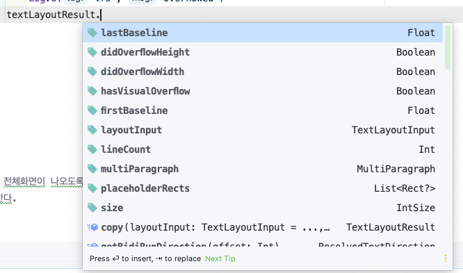
TextLayoutResult에는 꽤나 많은 프로퍼티가 있는데 나중에 기회가 된다면 본격적으로 다뤄보겠습니다.
style (스타일)
텍스트의 문단 모양을 설정하는 매개변수입니다.
Column(modifier = Modifier.fillMaxSize()) {
    Text(
        text = """
            ddddddddddddddddddddddddddddddddddddddddddddddddddddddddddddd
        """.trimIndent(),
        modifier = Modifier
            .height(100.dp)
            .background(color = Color.Black),
        color = Color.Red,
        letterSpacing = 3.sp,
        textAlign = TextAlign.Center,
        overflow = TextOverflow.Visible,
        softWrap = true,
        style = MaterialTheme.typography.displayLarge
    )
}
textSize를 설정하지 않았음에도 크게 나올 것을 볼 수 있습니다.
Typography 클래스의 속성을 보면 모든 문단 모양을 확인할 수 있습니다.
@Immutable
class Typography(
    val displayLarge: TextStyle = TypographyTokens.DisplayLarge,
    val displayMedium: TextStyle = TypographyTokens.DisplayMedium,
    val displaySmall: TextStyle = TypographyTokens.DisplaySmall,
    val headlineLarge: TextStyle = TypographyTokens.HeadlineLarge,
    val headlineMedium: TextStyle = TypographyTokens.HeadlineMedium,
    val headlineSmall: TextStyle = TypographyTokens.HeadlineSmall,
    val titleLarge: TextStyle = TypographyTokens.TitleLarge,
    val titleMedium: TextStyle = TypographyTokens.TitleMedium,
    val titleSmall: TextStyle = TypographyTokens.TitleSmall,
    val bodyLarge: TextStyle = TypographyTokens.BodyLarge,
    val bodyMedium: TextStyle = TypographyTokens.BodyMedium,
    val bodySmall: TextStyle = TypographyTokens.BodySmall,
    val labelLarge: TextStyle = TypographyTokens.LabelLarge,
    val labelMedium: TextStyle = TypographyTokens.LabelMedium,
    val labelSmall: TextStyle = TypographyTokens.LabelSmall,
) {
개발하는 어플이 문단 모양이 중요한 어플이라면 위 클래스의 속성을 적절히 사용하여 개발할 수 있습니다.
마치며
Text 컴포저블의 모든 매개변수를 살펴보는 시간을 가졌습니다.
함수 자체만 보면 너무 방대해서 컴포즈에 대한 두려움이 앞설 수 있지만 실상 써보면 자주 쓰는 건 몇 개 안 됩니다. ㅎㅎㅎ
그래도 아는 것과 모른 채로 지나가는 것은 아주 큰 차이가 있다고 생각하기 때문에, 이런 기능이 있었구나 정도만 아셔도 시작하는 데 있어서 충분하다고 생각합니다.
'안드로이드(Compose) > UI' 카테고리의 다른 글
| Button Material 3 (0) | 2024.04.16 |
|---|---|
| Button 기본 (0) | 2024.04.16 |
| Preview (0) | 2023.06.27 |